I’ve never really shared the story behind the Sportall.ca logo before…
When I created it, I wasn’t just trying to design a sports brand. I wanted it to represent something bigger.
The original vision for Sportall was to create a true “sport portal for all” — a welcoming entry point that helps people discover, access and connect with community sport and recreation opportunities across Canada.
That’s actually where the name came from.
Sport + all.
And yes… the extra “l” was intentional too. I wanted the name itself to feel more inclusive.
The hexagon shape was inspired by a honeycomb. To me, it represented community, cooperation and a hive of activity. I also loved the deeper meaning behind it — balance, harmony, interconnectedness and the idea that individual parts become stronger when connected together.
In many ways, that’s exactly what community sport looks like across Canada.
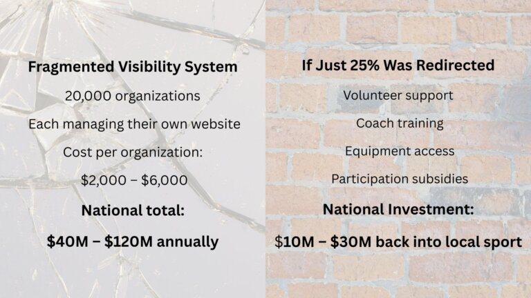
Thousands of organizations, volunteers, coaches, officials and families all working independently, but contributing to something much bigger together.
The figure in motion was intentionally designed to feel universal. I didn’t want it to clearly represent one gender, one body type or one specific sport. I wanted people to be able to see themselves in it.
You’ll also notice the figure extends outside the boundaries of the hexagon.
That was intentional too.
It was my way of representing the idea that sometimes we need to think beyond traditional systems and frameworks if we truly want to improve access, visibility and participation in community sport and recreation.
Even the ball was made intentionally small and abstract so it wouldn’t force people to think of only one sport. It could represent many sports… or simply movement, play and activity itself.
And of course, the red, white and black colours — along with the maple leaf — were chosen to reflect a strong Canadian identity and connection to communities across the country.
What’s interesting is that as Sportall has evolved, the logo seems to have evolved with it.
Today, when I look at it, I no longer just see a logo.
I see connection.
Access.
Belonging.
Movement.
Community.
Visibility.
And maybe most importantly, possibility.